
As organizations collect more telemetry data, their pipelines grow in complexity and scale. Telemetry pipelines are dynamic, continually adjusted to improve data quality, reduce costs, and meet evolving observability requirements. At this scale, even small configuration changes can significantly affect how much data moves through your pipeline.
Without clear visibility, you rely on assumptions. Did the new filtering rule actually reduce the amount of data you’re sending to the SIEM? How much did JSON formatting increase event size? Does the additional enrichment justify the extra storage and ingestion costs?
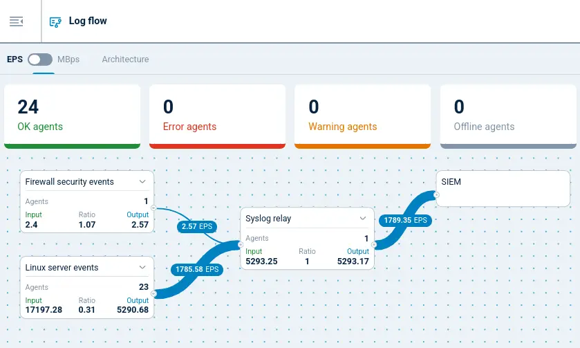
With NXLog Platform, you can now visualize the telemetry data flow and volume moving through your pipeline. It shows how much data enters an NXLog Agent instance and how much leaves it, allowing you to quickly understand how your configuration changes affect the data. This insight helps you validate your telemetry pipeline design and make informed decisions about enrichment and formatting.
The challenge of understanding telemetry transformations
Telemetry pipelines transform data as it flows through them. They filter events, enrich records with additional context, normalize formats, and route data to multiple destinations. Each transformation improves the usefulness of the data, but it also changes the amount of data moving through the system.
The hard part is understanding the impact of those changes. A filtering rule can remove thousands of unnecessary events, significantly reducing data volume. An enrichment step may add valuable context, but it also increases the size of every record. Even transforming data from one format to another, such as converting logs from plain text to JSON, can noticeably increase the payload size.
If you can’t clearly see how data flows through your pipeline, you end up relying on guesswork. A pipeline that, on paper, is designed to reduce telemetry volume may still forward large amounts of data, while enrichment can unexpectedly double or triple record size.
This uncertainty makes it difficult to evaluate whether a telemetry pipeline performs as intended. You need a way to observe how much data enters the pipeline, how transformations affect that data, and how much data ultimately leaves the system.
Data flow monitoring in NXLog Platform
To better understand how telemetry data moves through your pipeline, NXLog Platform provides data flow visualization. This feature shows how much data enters an agent through input modules and how much leaves it through output modules, giving you direct visibility into your pipeline configuration.
Instead of relying on assumptions, you can immediately see how transformations affect telemetry data volume. This visibility helps answer operational questions, such as:
-
Are your filtering rules reducing the amount of telemetry data sent to your SIEM?
-
How much overhead does enrichment introduce?
-
Does a format change significantly increase event size?
By comparing incoming and outgoing data volume, you can quickly gauge whether your telemetry pipeline is producing the results you expect.
Data flow visualization allows you to monitor data flow either as data volume in MB per second (MBps) or events per second (EPS), giving you two perspectives on how your pipeline behaves and helping you identify configuration and operational issues. For example, if the outgoing data volume is bigger than expected, the pipeline may be adding more data than anticipated. Or, if the data volume is smaller than expected, filtering rules may not match events correctly. With this insight, you can adjust your configuration and validate the results immediately.
On the other hand, if the input event rate consistently exceeds the output rate, the destination may not be able to keep up with the incoming data load. This mismatch can indicate network issues, a slow downstream system, or an output module that cannot process events fast enough (and if you hit such a situation, we would love to hear about it). By observing these metrics in NXLog Platform, you can quickly detect bottlenecks and investigate them before they escalate.
Understanding data flow visualization
At a high level, NXLog Platform’s data flow visualization represents your agent configuration as a set of input and output module instances connected by a processing pipeline. Each module instance shows the amount of telemetry data it handles, so you can follow where data originates and where it goes.
You can switch between events per second (EPS) and data volume in MB per second (MBps) depending on the insight you need. EPS helps you understand event throughput, which is useful when evaluating ingestion rates, processing capacity, or SIEM event limits. MBps focuses on data volume, helping you evaluate how transformations such as enrichment or format changes affect payload size.
Trimming Windows events before forwarding to a SIEM
Windows events are inherently verbose: each event includes a human-readable description and a number of structured fields that most SIEMs pre-load and therefore treat as redundant. Removing these unnecessary fields can reduce the size of each event significantly.
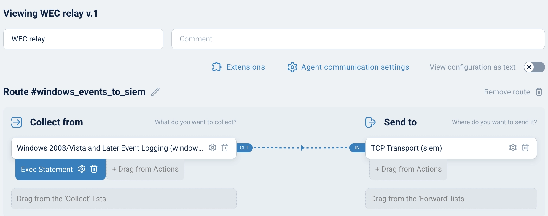
To illustrate how data flow visualization works in practice, consider a pipeline where NXLog Agent acts as a central Windows Event Collector (WEC). Windows endpoints are configured to forward their events using Windows Event Forwarding (WEF), and NXLog Agent strips the verbose descriptive text and redundant structured fields before forwarding the trimmed events to a SIEM.
The following NXLog Agent configuration defines this pipeline:
<Extension allowlist>
    Module    xm_rewrite
    Keep      AccountName, Channel, EventID, EventReceivedTime, \
              EventTime, Hostname, Severity, SeverityValue, \
              SourceName
</Extension>

<Input windows_events>
    Module    im_msvistalog
    <QueryXML>
        <QueryList>
            <Query Id="0" Path="ForwardedEvents">
                <Select Path="ForwardedEvents">*</Select>
            </Query>
        </QueryList>
    </QueryXML>
    Exec      allowlist->process();
</Input>

<Output siem>
    Module    om_tcp
    Host      siem.example.com:6514
</Output>

<Route windows_events_to_siem>
    Path      windows_events => siem
</Route>
In NXLog Platform, the same pipeline is represented visually in the configuration builder, making it easy to see how data moves between the input and output modules:
Reading the data flow visualization
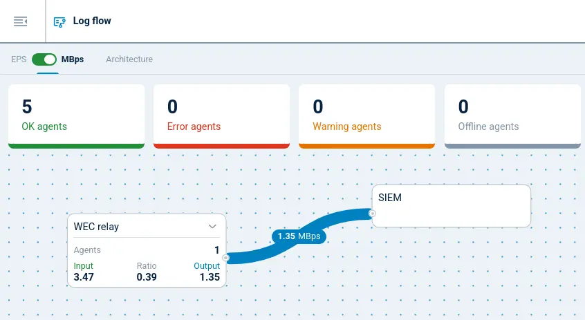
Once the pipeline is running, NXLog Platform’s data flow visualization shows the practical effect of the processing in real time. Because the configuration keeps only a small set of fields from each Windows event, you would expect the outgoing data volume to be significantly lower than the incoming volume. In the MBps view below, this is immediately visible: the outgoing data volume drops well below the incoming volume, confirming that the trimming step is working as expected.
Conclusion
Telemetry pipelines evolve continuously as you refine filtering rules, enrich events with additional context, and adjust how data flows to different destinations. Each of these changes affects the size and throughput of the data moving through the pipeline. Without clear visibility, it can be difficult to confirm whether these changes produce the expected results.
With NXLog Platform’s data flow visualization, you can see exactly how telemetry moves through your pipeline. By monitoring event throughput in EPS and data volume in MBps, you can validate configuration changes and identify potential pipeline bottlenecks. This visibility helps you make informed decisions about optimizing your telemetry data pipeline.
If you want to see data flow visualization in action, sign up for NXLog Platform to see how telemetry data flows through your own environment or explore the interactive demo with sample data.